words by Don Burton
You’ve finally sent that route you’ve been working on at the local crag and your friend (not belayer!) gets a picture of you topping out. You’re excited to look at it and post it on Facebook or Instagram, but when you open it up on your phone, it looks kind of "meh". I’m not a professional photographer, but here is an easy step-by-step guide I use to add a little pop to my photos with Adobe’s free mobile app, Lightroom [Android | iOS]. There are various mobile photo editing apps, but Lightroom offers features to satisfy an average user to a professional photographer. This is the general process I use to edit photos when I'm on the go.
Let’s use a sunset shot I took at New Jack City on a recent climbing trip. I took this photo using an iPhone 6.
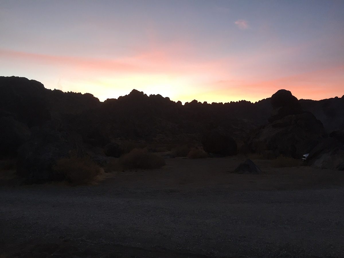
Original
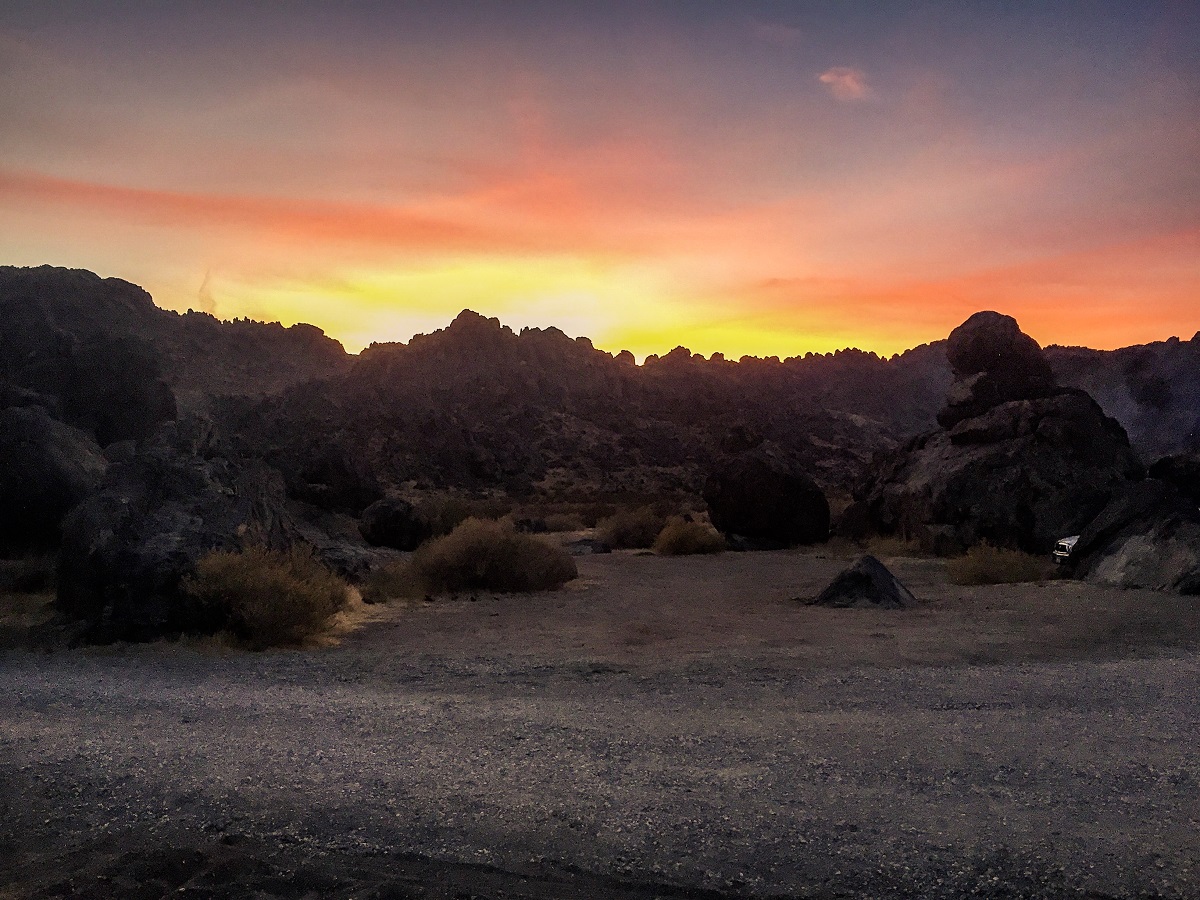
Edited with Lightroom
At the bottom of the app you will see pages containing different effects. We will be working with the Light, Effects and Detail pages.
Light Page
Step 1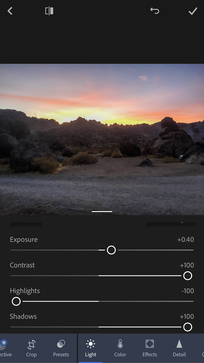
-Decrease highlights to -100
-Increase the shadows to +100
This adjusts the dynamic range of the photo, which is the range from the darkest parts of the picture to the brightest. Highlights focus on the "bright" parts of the photo, while shadows are the "dark". With this step we are making the shadows brighter and the highlights not so blown out. We can now see more details in the photo in the shadows and sky. [Editor's Note: It is easier to pull details from the shadows than it is to pull details from overblown highlights"
Step 2
-Increase the contrast.
Contrast makes your whites whiter and your blacks blacker. Usually I set the contrast to about +50 but this photo looked better at +100.
Step 3
-Increase or Decrease the Exposure a small amount.
Exposure is the amount of light that is processed by the camera. In Lightroom, it's a simple and easy way to increase or decrease the overall "brightness" of a photo. Although this can really improve your photos make sure not to over do it.
Effects Page
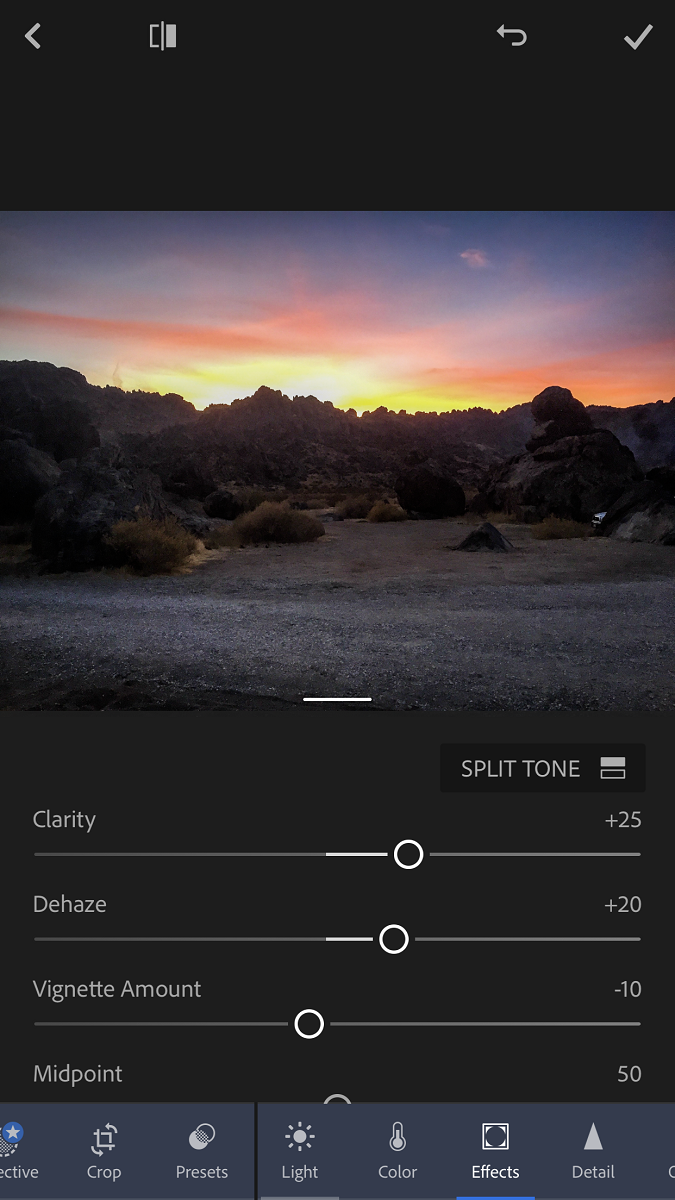 Step 4
-Increase the Clarity
Clarity increases the contrast in the mid tones, which are the areas of a picture that fall within the middle range of the exposure. You may notice some details may show up more. I like to set the Clarity somewhere between +20 and +35.
-Dehaze
This setting is exactly what it sounds like. If you have a picture with sky, glass or some sort of reflection, this can really help “clear” up some of these aspects. Slowly move the slider to the right until some detail in these areas come back. Less is more. If you apply too much, your photo will look over processed and fake. If you are familiar with polarizing filters, dehazing acts in a similar way.
-Vignette
The vignette effect darkens or lightens the outside of a focus point, usually in a radial manner. I apply this to most photos except night shots. Move the slider to the left and you will begin to see a vignette effect being applied, darkening the corners. It can help draw the eye to the subject. Plus, it looks cool! (Less is more though.)
Detail Page
Step 5
-Sharpening
Sharpening focuses and finds edges of details in the photos and darkens shadows. This can be very helpful in trying to create a focus on a specific object or area. Generally I don’t like to set this higher than +15 because like many settings it is easy for a photo to look over processed.
Final Thoughts
This is a framework to get you started on editing your own photos but don’t limit yourself to it. Try different settings and levels to see what you like and what works for different types of photos. This guide can be used on all types of photos whether they are interior shots of climbers at Sender One, portraits, candids, or night shots. There are no hard and fast rules. Experiment and have fun!